EPA 'environmental justice' map highlights California's pollution ills
Published on June 17th, 2015
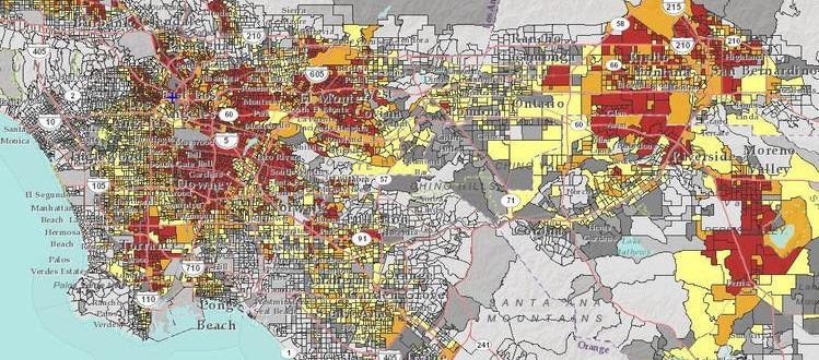
In the EPA's environmental justice map, red and orange shows census block groups in Southern California where close proximity to federal Superfund sites overlaps with a high percentage of low-income and minority residents. (Environmental Protection Agency)
Tony Barboza
June 10, 2015
Los Angeles Times
Many Southern California communities stand out as some of the nation’s worst environmental justice hot spots, according to a new map released Wednesday by the Obama administration.
The interactive online map created by the U.S. Environmental Protection Agency highlights low-income, minority communities across the country that face the greatest health risks from pollution. The analysis combines demographic and environmental data to identify where vulnerable populations face heavy burdens from air pollution, traffic congestion, lead paint, hazardous waste sites and other hazards.
The EPA analysis of more than 217,000 census block groups — small communities that average about 1,400 residents — found that many communities in California, especially in southeast Los Angeles County, the Inland Empire and the San Joaquin Valley, are among the most at-risk in the nation.
Cesar Campos, who directs the Central California Environmental Justice Network and previewed the map, said it showed that parts of California were “comparable to places in Mississippi or the Appalachian Mountains.”
“You think of California as one the richest states and yet, there are still communities that are suffering as if they were in the poorest states in the nation,” Campos said.
The EPA analysis follows a similar environmental justice map completed last year by California agencies. The state is already using that map, called CalEnviroScreen, to distribute funds from its cap-and-trade program and to direct pollution-cutting projects to some of the state’s most disadvantaged neighborhoods.
The EPA said it would not use the data to label specific areas as environmental justice zones or as the basis for enforcement, funding and permitting decisions. Rather, it will be used to inform and guide environmental justice work by the agency, which refers to the map as a “pre-decisional” screening tool.
The EPA’s environmental justice director, Matthew Tejada, said the map, created nearly five years ago and used internally since 2012, “is one of the most visible steps that we have taken at incorporating environmental justice in a consistent way throughout the agency.”
The agency has already used EJSCREEN as part of a program targeting 50 environmentally burdened and economically distressed communities over next two years, he said. In California, the agency chose to prioritize the Imperial Valley and the Santa Clara County city of Gilroy.
The color-coded map allows users to search through eight measures of environmental impact. Among them are levels of ozone and fine-particle air pollution, proximity to hazardous waste facilities and Superfund dumping sites. Users can see how a community ranks relative to the rest of the nation.
Each of the criteria is indexed to demographic data — the percentage of the population that is low-income and minority — to highlight areas that face disproportionate effects from pollution.
The map drew some criticism from environmental groups and academics for its failure to include important environmental health data, such as cancer risk from toxic air pollutants.
Some of those measures were excluded from the current version of the map, the EPA said, because the data was 10 years old. But the agency plans to update the map with additional environmental data as it becomes available.
The EPA's map lacks some of the nuances of the one pioneered last year by California. The EPA map relies on less robust, nationally consistent data, said Manuel Pastor, director of the Program for Environmental and Regional Equity at USC.
Still, Pastor said, “It’s a very sophisticated and good tool that is going to be exceptionally useful for those other states in helping them pinpoint where the problems are.”


